


SOLO
Web, UX/UI,Research
Brief
Figma,Miro,Photoshop, Illustrator
8 Weeks
MilkyWayGalaxyGames is one of the best online gaming shops. Their website and portal provide gamers with easy access to browse and purchase digital merchandise such as in-game currencies, leveled-up accounts, skins, and more. Games supported include popular titles such as Fornite, Call of Duty, and GTA.
Business Problem/ Design goal
MWGG is a profitable business but they had issues with scaling their business due to massive amounts of customer-support inquiries and a high bounce rate. Because the website is the primary method of browsing and transacting for the user, business owners had strong signal that improving the design of the website would help remediate these issues.
What I did for this redesign?
Conducted research such as competitive analysis, user interviews and usability testing to identify user pain-points and product-gaps
Rearchitected the website for more intuitive navigation and browsing experiences
Optimized the purchase flow by implementing new features such as shopping cart, translation, buyer protection, shopping process steps, customer reviews, frequent Q&A, etc
Enhanced the visual appeal of the website by developing a new design language system and completely rebranded the product with new typography, colors, and look and feel
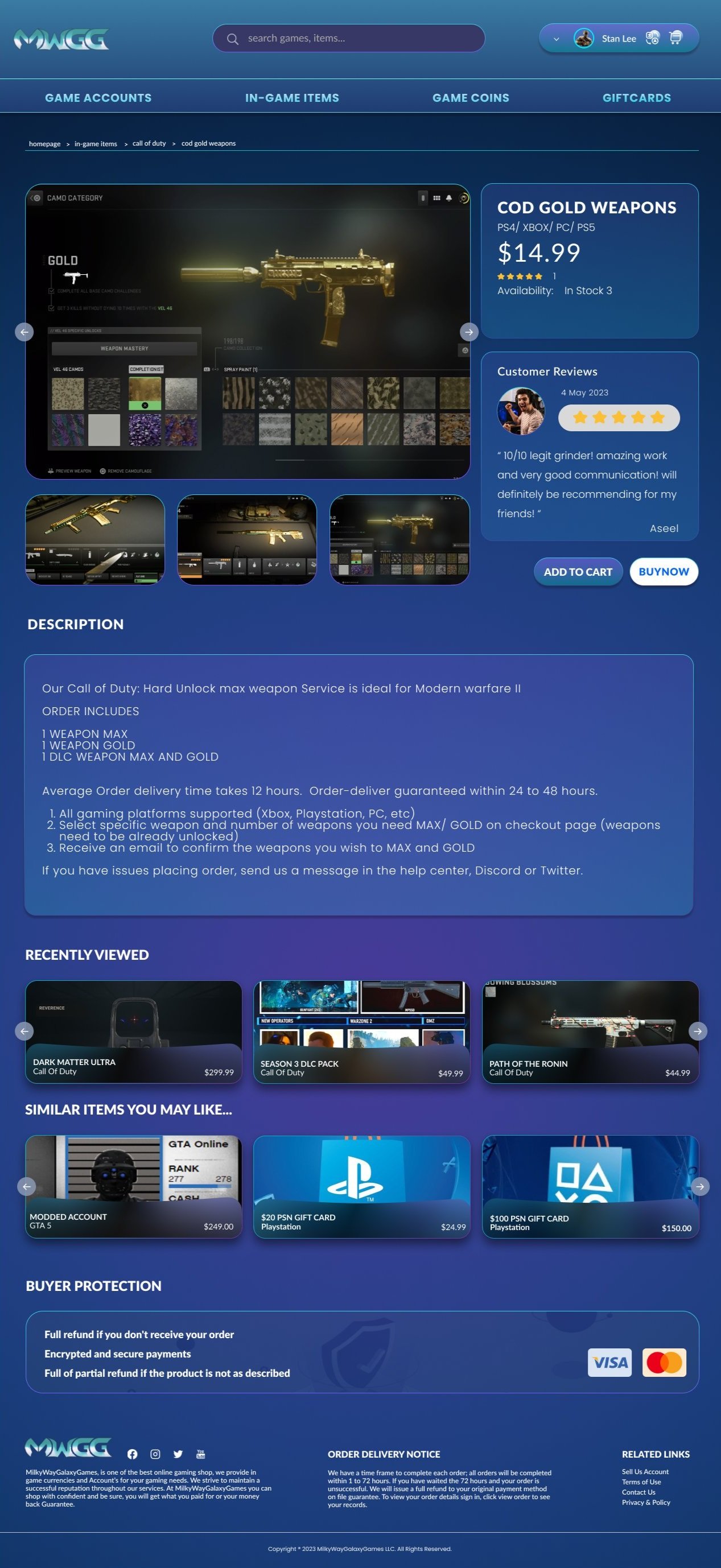
After - Itempage
After - Userpage

Research
User interviews
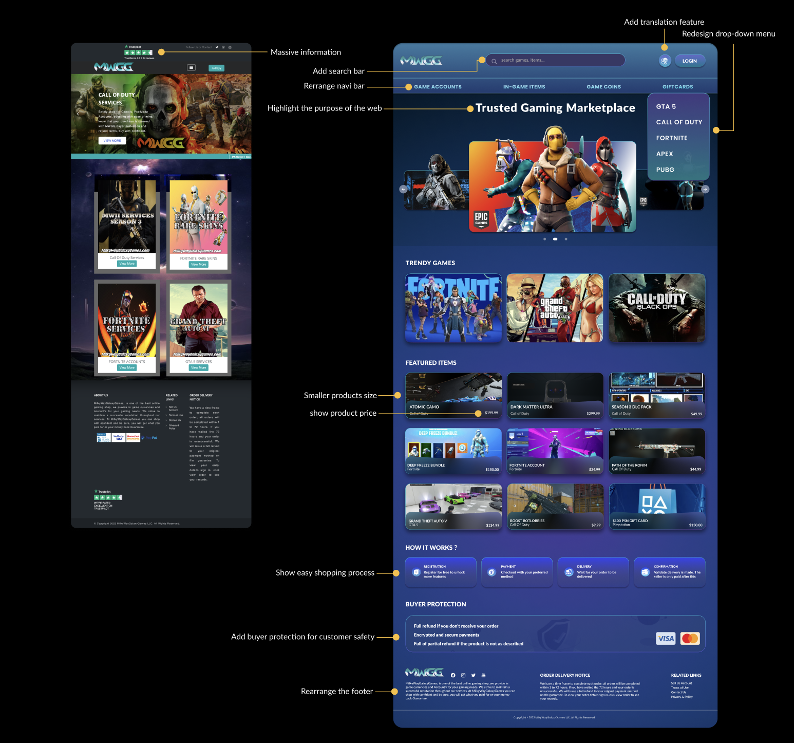
After - Homepage
Before - Homepage


I conducted 8 user interviews with a sample of five MWGG users who recently completed purchases on the website in order to understand more about their needs, wants, and behaviors. Some of the things I focused on with the user conversations:
What led them to MWGG and what were they looking to achieve with the website?
How was their recent purchasing experience? What did they like? Is there anything they want to change or improve?
What do they think overall about MWGG as a company?
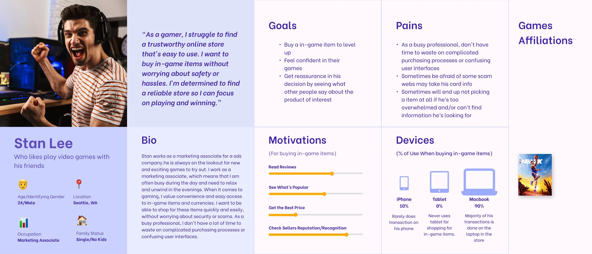
Persona
After the user-interviews, I developed a general persona to synthesize my findings and develop a better picture of who I was designing for:
User journey

I developed a user-journey map from the conversation with stakeholder and user-interviews to map out a typical experience of a user on the website. In addition to jotting down some pain-points that users mentioned, I conducted a heuristic evaluation to further note potential pain-points and develop preliminary ideas to solve them.
Usability testing
I recruited and tested four gamers that loosely aligned with my developed persona and usability tested them with the MWGG website to further uncover any issues. They completed tasks related to a typical purchase journey.

Research Findings
I discovered there were a myriad of issues in the browsing/ shopping experience as well as the payment experience:
Site-Architecture and Navigational Issues
Users couldn’t find what they were looking for due to poor site architecture
Users had issues navigating due to confusing and inconsistent UI patternsPage-Level Information-Hierarchy Issues
Users were frustrated with incomplete or inconsistent information on item-detail and other pages
Users had a hard time consuming information on the website because visual design did not follow design best-practices and accessibility standards
Users generally had a lot of common questions, and there were no resources to answer those questionsDifficult Checkout Process
Users reported the checkout process was complicated and cumbersome
Lack of features such as shopping cart and search bar made browsing and payment process difficult
Shoppers reported unintuitive UI in the checkout experience
Iteration
Sitemap
Because one of the main user painpoints was that browsing and finding what they needed was difficult, I first revamped the site architecture.
The site previously was organized by game, but I found users mainly wanted to know what merchandise was supported first
Added cart and search feature to the global nav bar
I reorganized the accounts page and functions within

I went through multiple iterations, collecting feedback from stakeholders throughout the process.
Add and adjust some missing details, such as a breadcrumbs, a search bar, and removal of ratings, etc.
Rearrange the hierarchy of information architecture. Summarize footer information.
Delete the messy background to make the entire page consistent.

Final Comps
Next Steps
Nothing is over with this project, as there is so much we learned about MWGG and its potential, from our current and former users, including data from user testing and interviews. I learned a lot about the world of the E-Commerce, design system, front-end development and how to reorganize information architecture in a logical way, thanks to the great people I've been able to interact with. Here are some of the points I presented to MWGG at the end of the project:
Short-term
Continue to user-test the new design and iterate new versions of the design as needed for further testing.
Work with Samuel Lee, the developer lead, to implement design changes and determine whether some of the new features or functions can be done with the existing structure
Long-term
Make some functional changes to the app to improve user experience
More testimonials written


