3 Weeks
Figma,Miro,Photoshop
Web app, UX/UI,Research
SOLO
What is SteamDB?
SteamDB is a comprehensive database and analytical tool for Steam's software library and economy, providing detailed information on games, applications, sales, and user statistics.
Platform: Steam game database
Features: Analytical tool
Target users: Gamers, Developers, Publishers
Quick Overview
Research
Target Users and Needs
Gamers
Developers
Quickly find games that are popular, have good review, or match their interest
Make a purchase decision based on price history and budget
Analysis market dynamics via data & reports
Analysis own games via user behaviors and feedback
What’s The Problem?
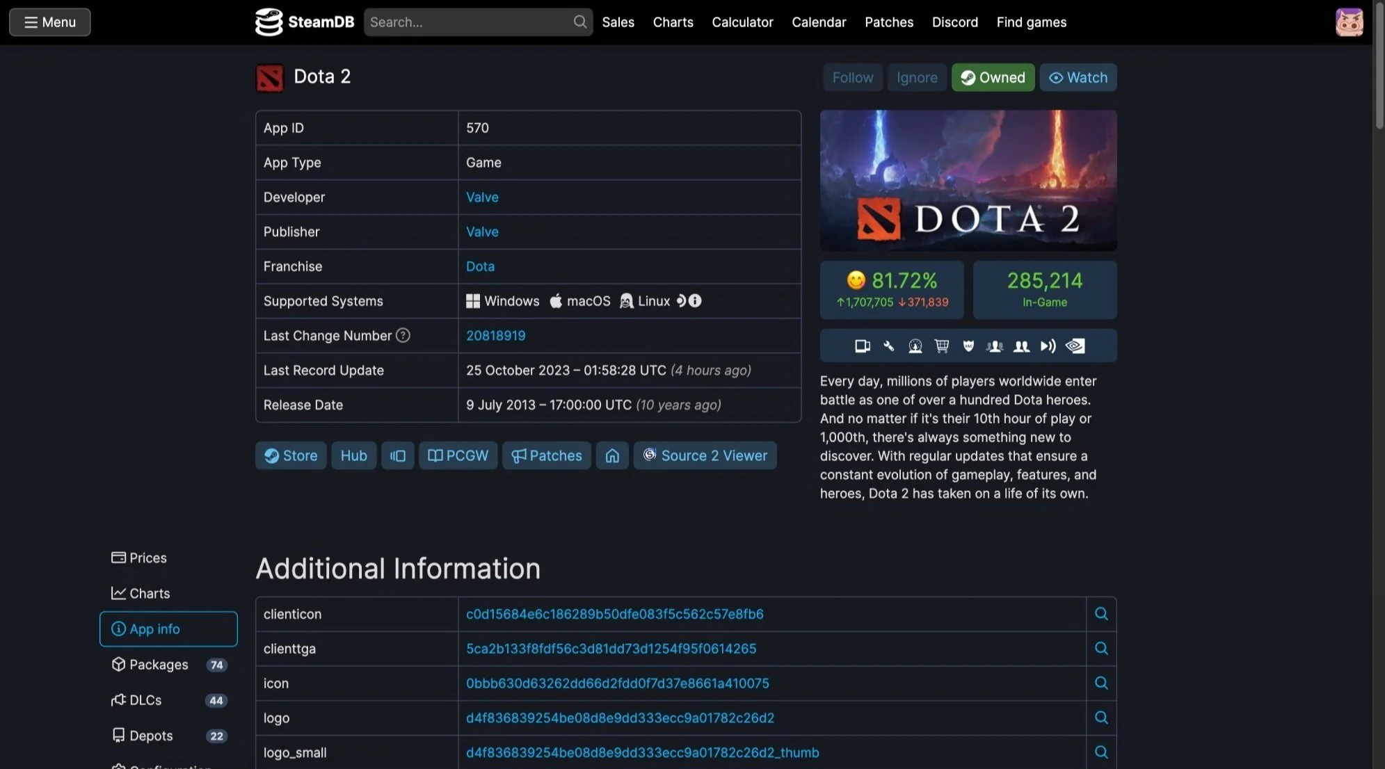
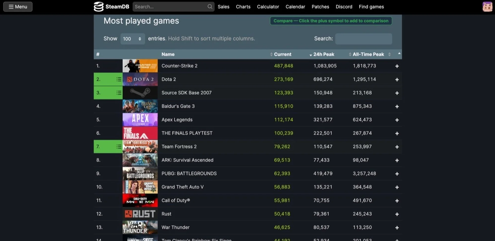
Overwhelming home page leads to chaos information to find the key game
Lack of data for market dynamics & reports
No personalized features and not easy to compare with games
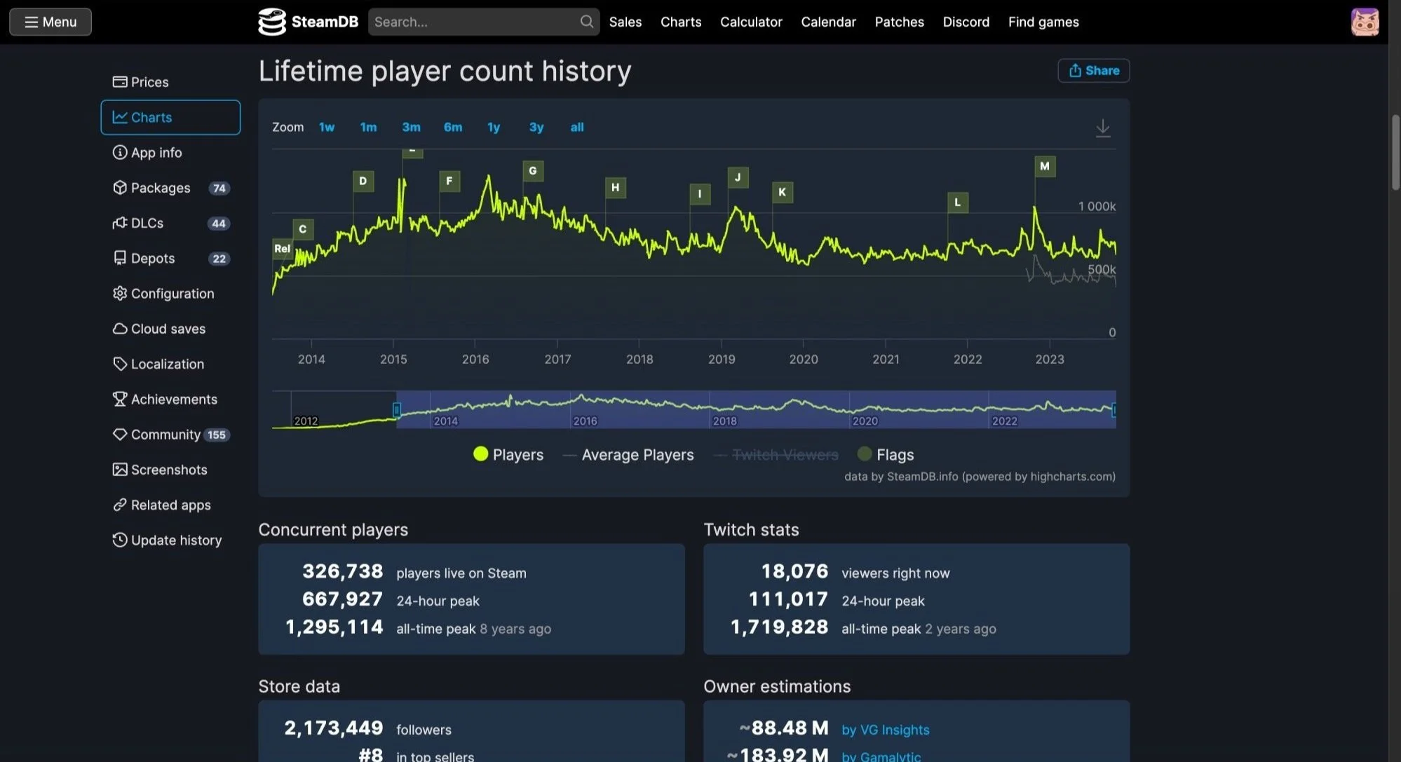
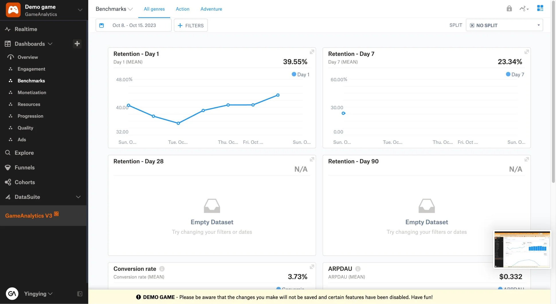
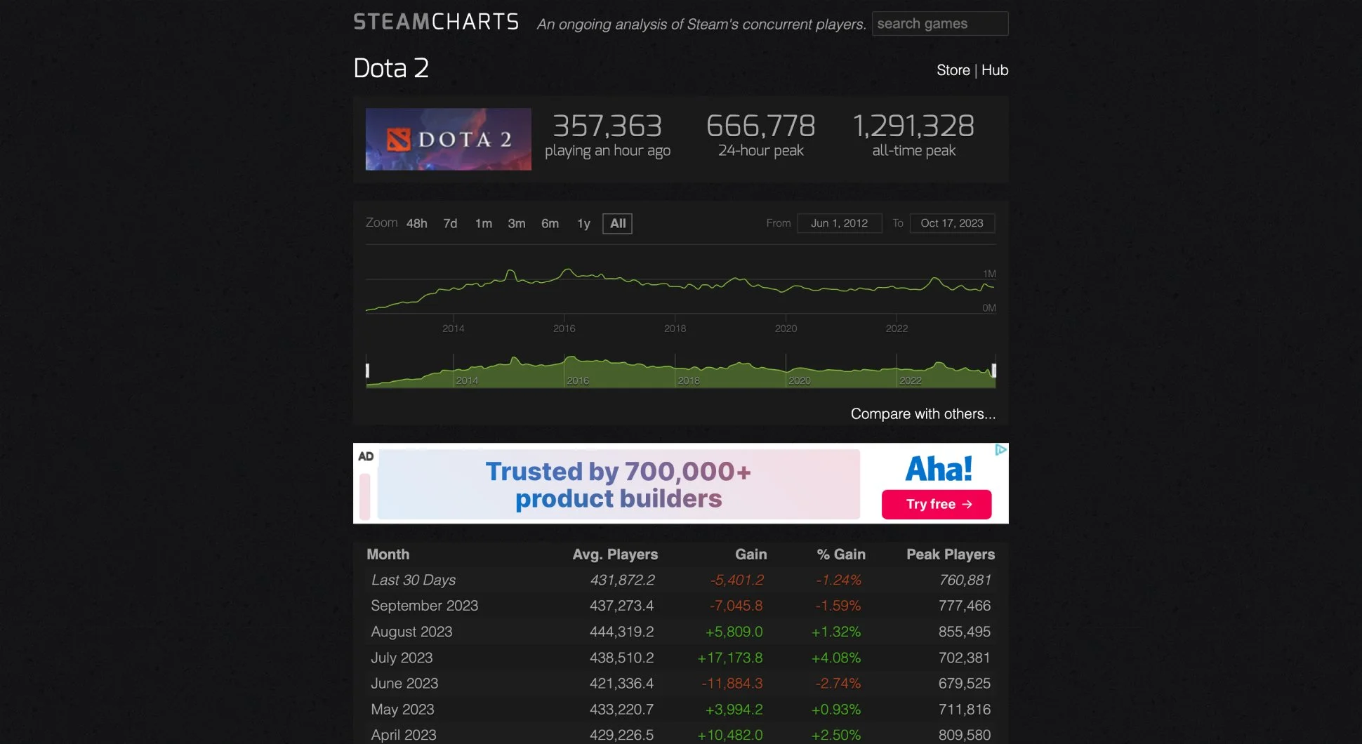
Messy game data chart
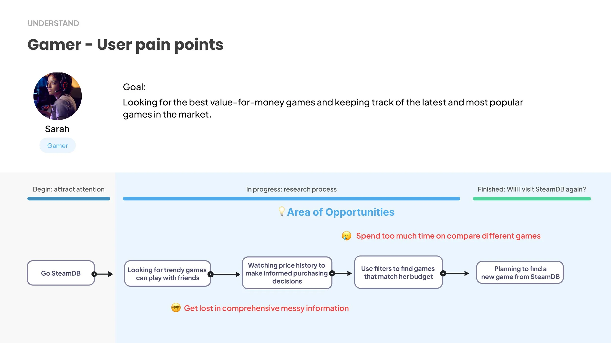
Persona and User Jounery
Takeways
Hard to find key info leads to inefficient
Current information architecture makes finding necessary information too time-consuming
Data is scattered leads to not-useful insight
Data is scattered and difficult to consolidate into a useful report
Lack of personalized and compare features
Business strategy
I researched other competitors to get opportunities for our business model. What I took away were
1. Charged webs have dashboard but only for the game developed by users, which means they could’t compare with other games.
2. Free webs don’t have a functional dashboard, also data is insufficient
So i think our product could be a free dashboard and has sufficient data.
Design Goals
Better analysis feature
Finding key info efficiently
Research shows developers and gamers both value trendy games, news, rates and user reviews, as they reflect market dynamics.
Visual dashboard intuitively displays key information, help users to analysis.
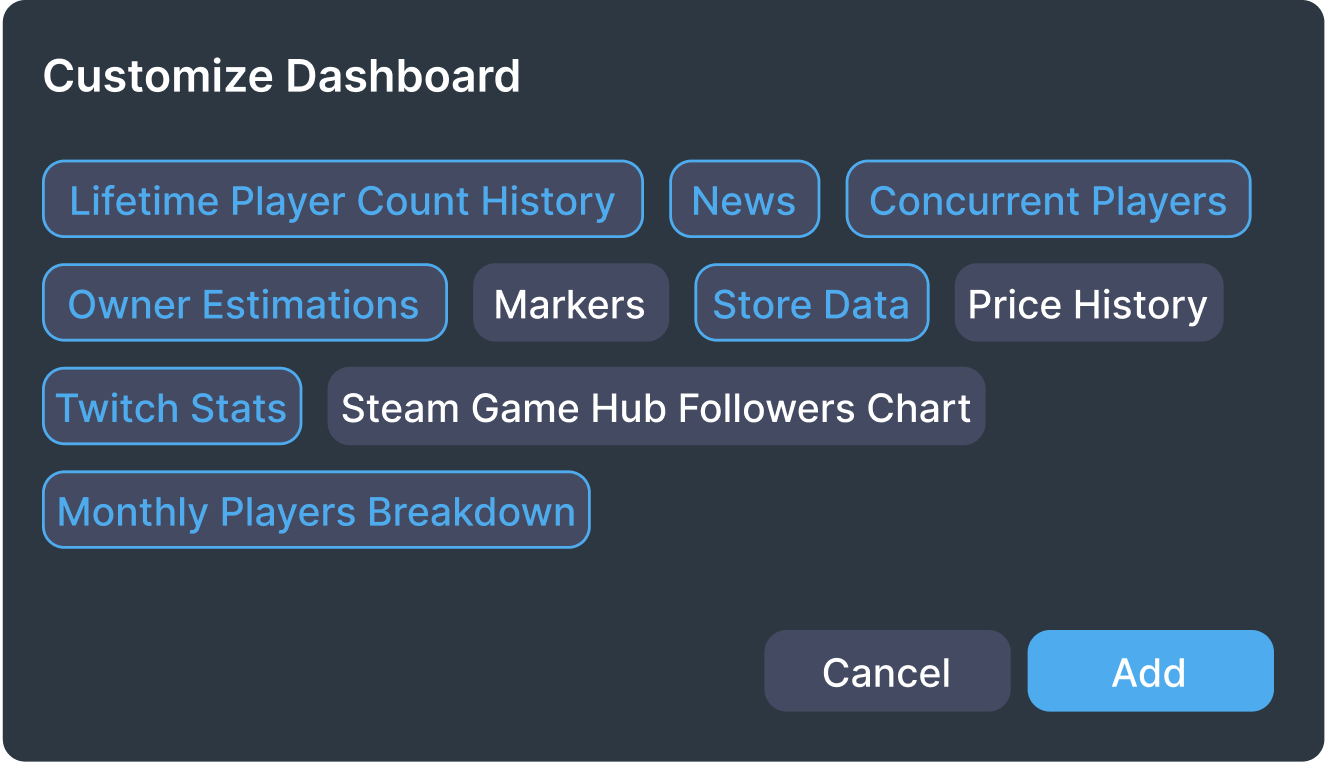
Add customized modules to dashboard
A personalize feature, let users add the metrics they truly need.
Ideate
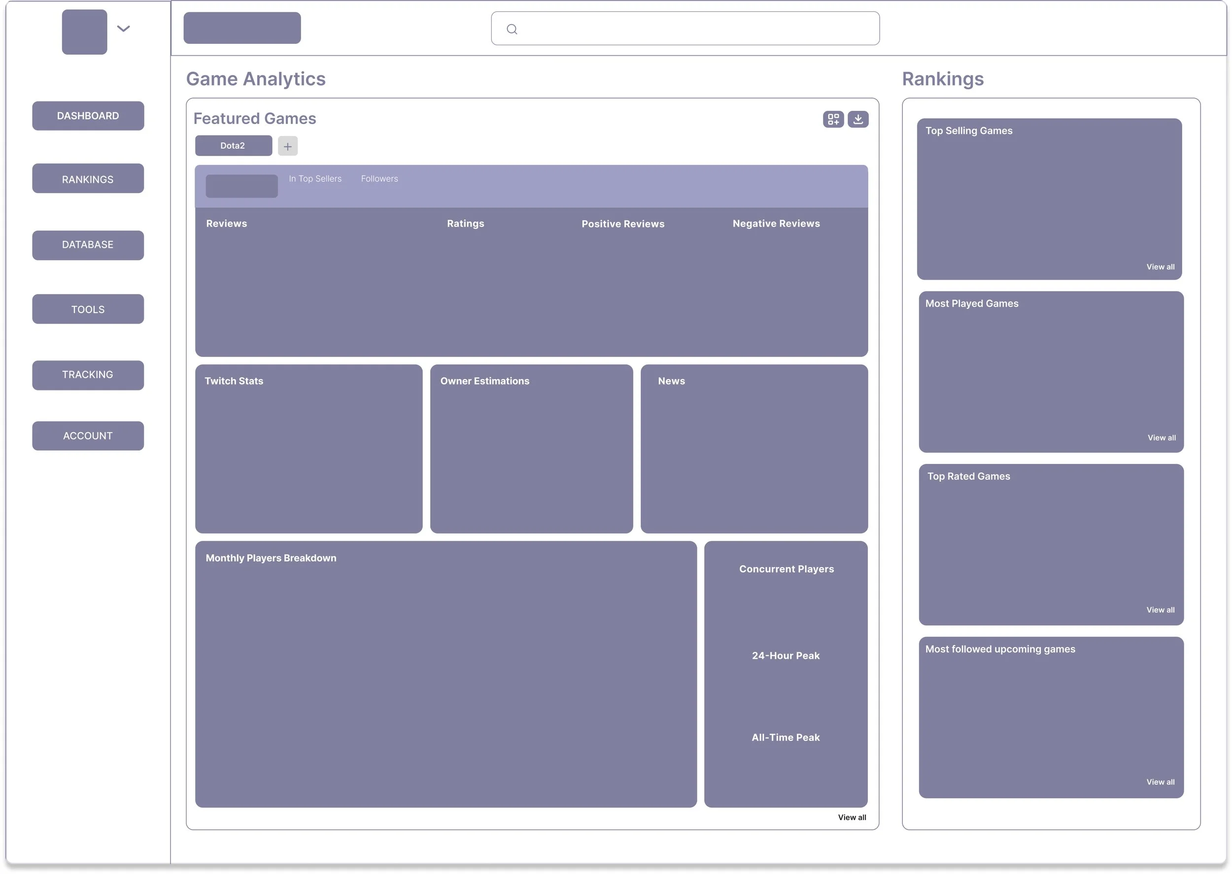
Low-Fi Prototype
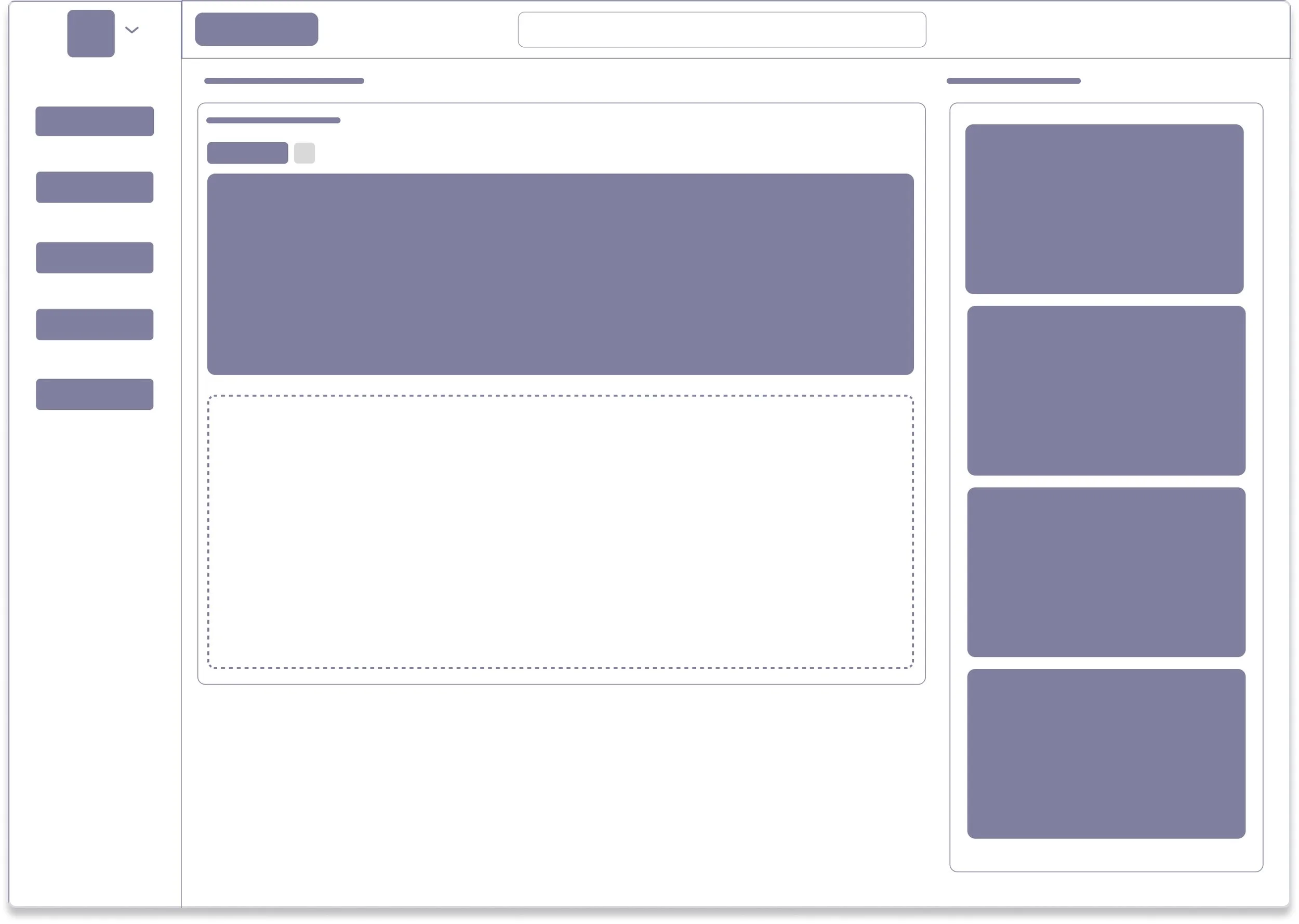
Semi Customized dashboard
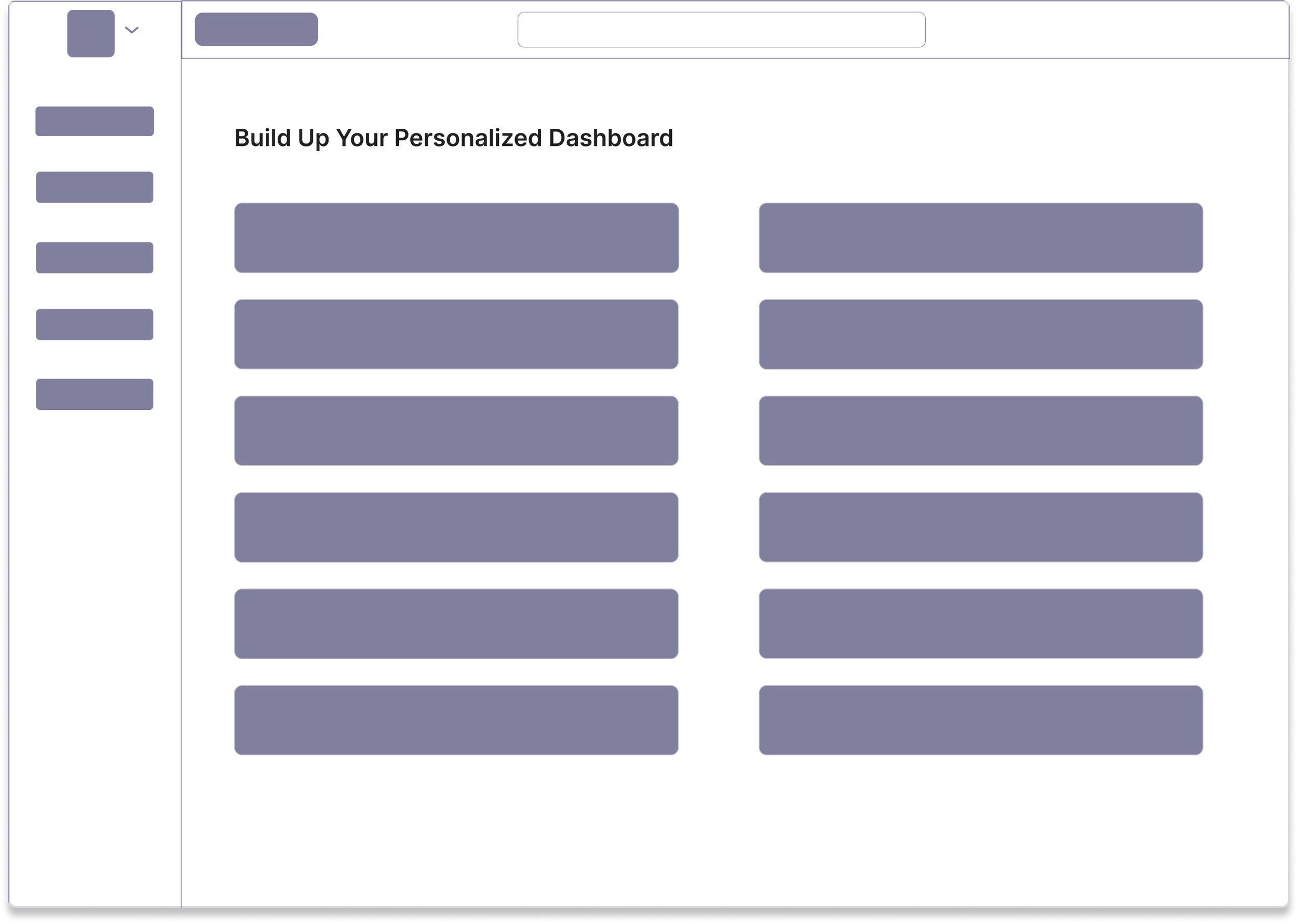
Full Customized dashboard
After I compare the pros and cons, I decided to go with the semi customized dashboard since most of users they looking to directly see the data to avoid more steps.
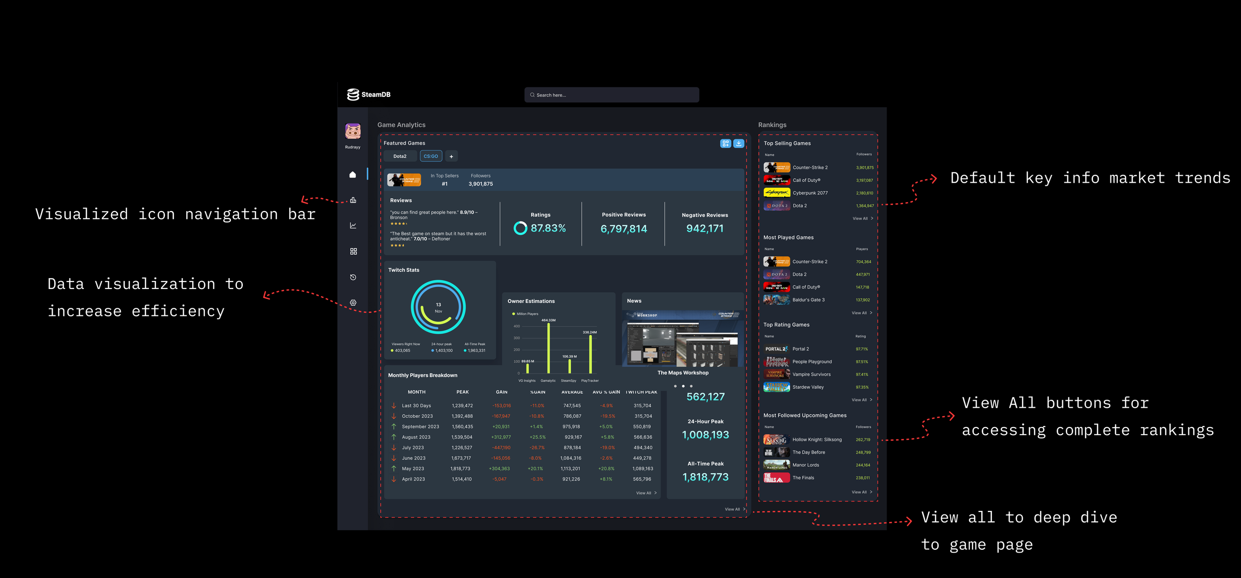
Hi-Fi Prototype
Pain point 1: Current information architecture makes finding necessary information too time-consuming.
Pain point 2: Lack of personalized features.
Add featured games to get analysis
Pain point 3: Data is scattered and difficult to consolidate into a useful report.
Get customized game report
Switch game labels to quickly
compare with other games
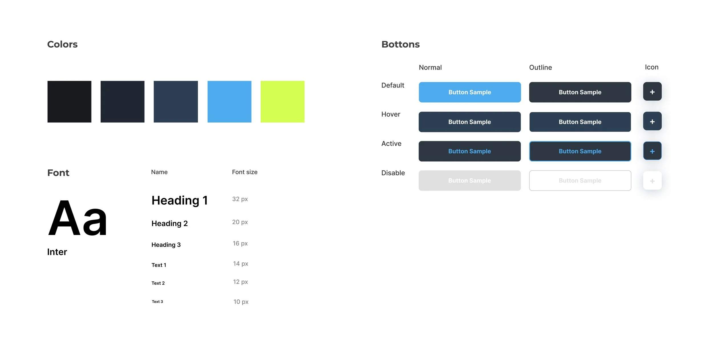
Style Guide
Reflection
Takeways
In this project, I learned a lot. I challenged myself to think of a lot of iterations, present them to my mentor, and test them with users. I took advantage of our discord ty to ask for feedback proactively. my main takeways are:
I prioritized the user needs in details with reducing the click times and the range of interaction required.
Organize a presentation deck in a logical way.
Next Steps
If I have more time, I would continue to gather user feedback and make improvements on next version, like adding chart comparisons of different games.


